
3discover: bringing technology to its website
The redesigned 3discover website presents prosthetic covers and 3D services through technology-led design, animation, mobile navigation and preserved URLs.
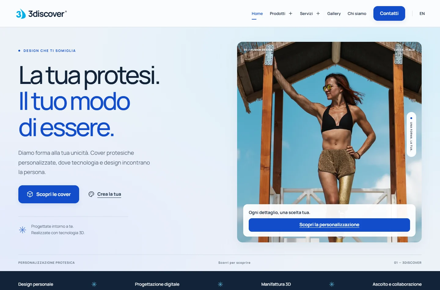
A bilingual website for technology and personalisation.
The 3discover project combines a new design, renewed mobile navigation and existing URL continuity, with dedicated pages for prosthetic covers, tactile maps and 3D services.
Where we started.
3discover creates personalised prosthetic covers, tactile maps and 3D manufacturing and digitisation solutions. Its previous website already presented the business and generated online enquiries, according to the owner. Its appearance and smartphone experience, however, no longer reflected the company’s work.
The challenge.
The website was dated and difficult to navigate on mobile. The redesign needed to make products and services easier to understand, convey the company’s technological identity and respect existing paths that people could already find through search engines.
What we did.
- A new visual direction using blue tones, authentic photography and product imagery, with greater prominence for prosthetic covers.
- A menu retaining the previous website’s page hierarchy, adapted for smartphone navigation.
- Section entrance animations, button and card interactions and animated icons that respect reduced-motion preferences.
- Italian and English versions with corresponding pages and contextual language switching.
- Relevant existing content recovered and historical commercial URLs retained, with redirects for replaced paths.
- SEO titles and descriptions, canonical URLs, hreflang and a sitemap on the final domain.
A new website that reflects the business.
- The new website is live on 3discover’s final domain, in Italian and English.
- The client expressed strong satisfaction with the work, according to feedback collected by the E-ROE team.
- The project provides renewed mobile navigation and a visual presentation that reflects the company’s technological work.
- Greater visibility and new enquiries are SEO goals.
Design, motion and navigation.
The redesign brought together the company’s identity, the ease of exploring its offering and continuity with content already available online.
A visual language that reflects technology.
Blue tones, gradients, circular motifs and authentic photography make room for both the precision of 3D work and the people who wear the covers. The homepage highlights personalisation and guides visitors towards products, accessibility and services.
Pages and subpages that are easy to explore.
The menu hierarchy retains the previous website’s main areas. On smartphones, products and services have expandable submenus, readable text and generous buttons. The mobile experience was a priority throughout the project and client revisions.
Motion supports the content.
Progressive section entrances, responsive buttons, cards and icons make the experience more dynamic. Animations stay brief and respect reduced-motion preferences, while text, images and links remain accessible.
Renewing the website while retaining existing paths.
The English version accompanies the Italian website with corresponding pages. SEO work recovers relevant content, retains historical commercial URLs and sets up necessary redirects, alongside metadata, the sitemap and links between languages.
Project images.
We only display authorized materials.