A display site at Piacenza** is often judged by the homepage. It is the page that meets those looking for the name of the activity, comes from Google Business Profile, opens a link received on WhatsApp or wants to check a company recommended by someone.
In a few seconds, that person has to understand four things: what you offer, for whom the service is, where you work and what step you can take. If the answer requires you to scroll half the page, interpret a generic slogan or open the menu, the homepage is asking too much work.
This guide does not repeat how much a site costs or how the whole project takes place: for these themes there are already deepenings oncosts of a website at Piacenzaandphases of implementation. Here we analyze only the initial page and its commercial task.
In short:* an effective homepage accompanies from understanding to contact. First it clarifies the promise, then it presents services and tests, finally it makes it easy to choose the next step.
The homepage should not tell everything
The most frequent problem is not the lack of information, but the absence of a hierarchy. The company tries to insert in the same page history, services, products, certifications, news, partners and values, giving each element the same importance.
The homepage should work as a map. Introduces the task, highlights priorities and leads to more specific pages. A person interested in a service must quickly recognize the correct path; those who want to verify reliability must find evidence; those who are already convinced must be able to contact the company.
When services and public are many, a multi-page structure is normally clearer. The comparison betweensite one page and multipagehelps to evaluate this choice without turning the homepage into an endless catalog.
The first screen must answer four questions
The visible part before scrolling is often occupied by a large image and a phrase like “quality and innovation at your service”. It is pleasant, but it could belong to dozens of different companies.
A first useful screen answers:
- **What do you offer? * Use the name of the service or an understandable description.
- Who are you addressing? ** Specifies the type of customer when helping to qualify.
- Where are you working? ** Indica Piacenza or the area served if the proximity counts.
- What can I do now?* Proposing concrete and consistent action.
For example, “electric plants for companies in Piacenza and province” informs more of “energy for your future”. The second message can become a creative element, but should not replace the explanation.
The main button must describe the next step: “Request an inspection”, “Prenounced a first interview” or “Call availability” are more informative than “Discover more”.
Submit services as choices, not as labels
After the first screen, the homepage must help the person recognize their need. A list of technical names is rarely enough.
For each priority service, at least:
- a short definition;
- the problem or the result to which it connects;
- the type of customer to which it is intended;
- a link to the dedicated page;
- an image or an example, when clarifying better than the text.
Three or four main services are easier to understand than twelve indistinguishable panels. Secondary activities can live in the internal pages or in a complete overview.
If you do not know what information to organize, thesite structure generatorallows you to start from target, public and offer instead of a standard menu.

Make the promise credible
A homepage does not convert because it uses many call to action. It converts more easily when it reduces perceived risk.
The tests can take different forms:
- documented projects;
- real photographs of people, headquarters or works;
- Authorized reviews;
- examples before and after relevant;
- verifiable and explained numbers;
- certifications really useful to choice;
- customers or sectors served, in compliance with authorisations;
- a clear process that shows what happens after contact.
The evidence must be close to the claim it claims. If you declare rapidity, explain the process and the times. If you talk about local experience, show jobs or recognizable contexts. If you promise customization, avoid presenting all the same examples.
The E-ROE portfolio shows a useful principle: a project tells more than a gallery when it explains the context, work and verifiable outcome.
Our guide to presenting real projects on a showcase website explains how to apply that principle without inventing results or publishing material without permission.
Use Piacenza usefully, not repetitive
The local relevance arises from the clarity of the activity and the area served, not from the mechanical repetition of the city.
On the homepage they can appear naturally:
- headquarters and operating zone;
- municipalities or provinces actually served;
- directions to reach the activity;
- authorized local projects;
- reviews citing real experiences;
- schedule and schedule;
- consistent connections with Google Business Profile.
If the company works throughout Italia, forcing an entirely local presentation can restrict the message. In that case it is more correct to explain the site to Piacenza and the real operating range, creating local pages only when there are relevant content and services.
Google recommends content designed first of all for people, useful and reliable, not pages built just to intercept keywords. The official guide oncontent people-firstis a better reference than any rule on the density of the keyword.
Explain the method before asking for trust
For many services, the visitor does not only fear the price. Fear of not knowing what will happen after the request.
A brief section on the method can clarify:
- as the first comparison occurs;
- which information must provide the customer;
- what is delivered or realized;
- which are the moments of approval;
- how times, assistance and subsequent steps are managed.
No need to describe any operational detail. Just understandable steps that eliminate ambiguity. For E-ROE, for example, the pageSite Ready Before Paying at Piacenzamakes explicit that the customer can see a first proposal before deciding whether to publish it.
Do you have a homepage but do you not know if it really communicates the value of the activity? Thetest of five secondshelps control clarity, recipient and main action before stepping into design.
Choose a main call to action
Telephone, email, form, WhatsApp and booking can coexist, but should not compete with the same weight.
The choice depends on the service:
- phone*, when the request is urgent or requires little information;
- WhatsApp, when quick and informal contact is needed;
- module*, when you need to collect minimum data to respond well;
- book*, when slots exist and a first standardized call;
- See*, when times and location guide the decision.
Define a main action and keep it consistent at the decisive points of the page. The alternatives must remain visible without turning each section into a button.
The message after sending is also important: it must confirm the reception, indicate the response times and explain what will happen. A module that ends with “invited” still leaves a part of the undefined path.
Design first for your smartphone
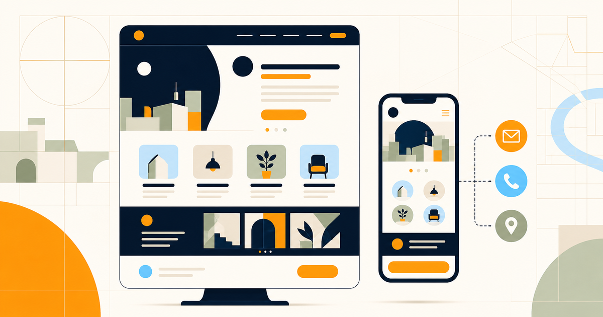
Those looking for a local activity can be found by car, on break or near the premises. By phone you want to read, call, open the map or send a request without zoom and without closing invasive windows.
Then check:
- legibility of the initial title;
- real height of the first screen;
- easily selectable menus and buttons;
- clickable phone numbers;
- form with few necessary fields;
- tablets and stable images during loading;
- contrast and spacing;
- absence of elements that cover the content;
- behavior with non-perfect connections.
Google invites you to evaluate the page experience in a total way, without reducing it to a single metric. Documentationpage experiencecombines performance, mobile usability, security and absence of excessive interruptions.
Connect homepage, Google tab and social media
The homepage is often the arrival point of different channels. Message, images and information must therefore be consistent.
If Google Business Profile presents a service that the site does not appoint, the user may doubt that he has arrived in the right place. If a social content promotes specific advice, the link should not necessarily lead to a generic homepage: a dedicated page can continue the speech better.
The guide toLocal SEO at Piacenzadeepens consistency between site, profile, reviews and local pages. The homepage remains the base, but must not replace all destinations.
Measure requests, not only visits
To understand if the homepage works you must observe real actions:
- send the form;
- click on phone or WhatsApp;
- requests for directions;
- reservations;
- access to the service pages;
- quality of requests received;
- response times and commercial result.
A week with few visits may not provide sufficient sample. It is more useful to check before the tracking works, then observe consistent periods and note changes. If you change title, buttons, services and images at the same time, you won’t know what action it has engraved.
Checklist of the homepage of a showcase website
Before posting, check that:
- activity, target and area are understandable in the first screen;
- the title is not an interchangeable slogan;
- priority services lead to specific pages;
- the evidence is real and close to promises;
- the method explains what happens after contact;
- the main call to action is recognizable;
- phone, WhatsApp and module function from mobile;
- Piacenza appears where it is informative, without forced repetitions;
- title, description, H1 and canonical are consistent;
- events and requests are measurable;
- there are no errors, broken links or content out of date.
Frequently asked questions
What must contain the homepage of a showcase website?
It must clarify what the activity offers, to whom it addresses and in which area it operates; then submit services, differences, tests, method, frequent questions and a simple contact.
Do you need to write Piacenza in the homepage title?
It is useful when the location is really relevant to the service. The city must appear naturally along with the activity, without being artificially repeated in each section.
How long should a homepage be?
There is no universal length. It must contain the information necessary to direct the person and direct it to the pages of deepening, without becoming a list of everything that the company does.
Better module, WhatsApp or phone?
Depends on the type of request. It is useful to choose a main action and offer one or two alternatives, avoiding a row of buttons with the same importance.
An effective homepage is enough to place on Google?
No. It helps clarify activities and area served, but visibility also depends on service pages, content, technical quality, authority, links and local signals.
Next step
If the site does not exist or the current homepage no longer represents the activity, target parts, priority service and type of request desired. With these three elements it is possible to design a concrete structure without pursuing an equal model for all.
E-ROE creates custom showcase websites for Piacenza and province activities. You canrequest a first navigational proposaland evaluate it before deciding whether to publish it.